
Norway and Iceland: Separate the Field Colour from the Cross
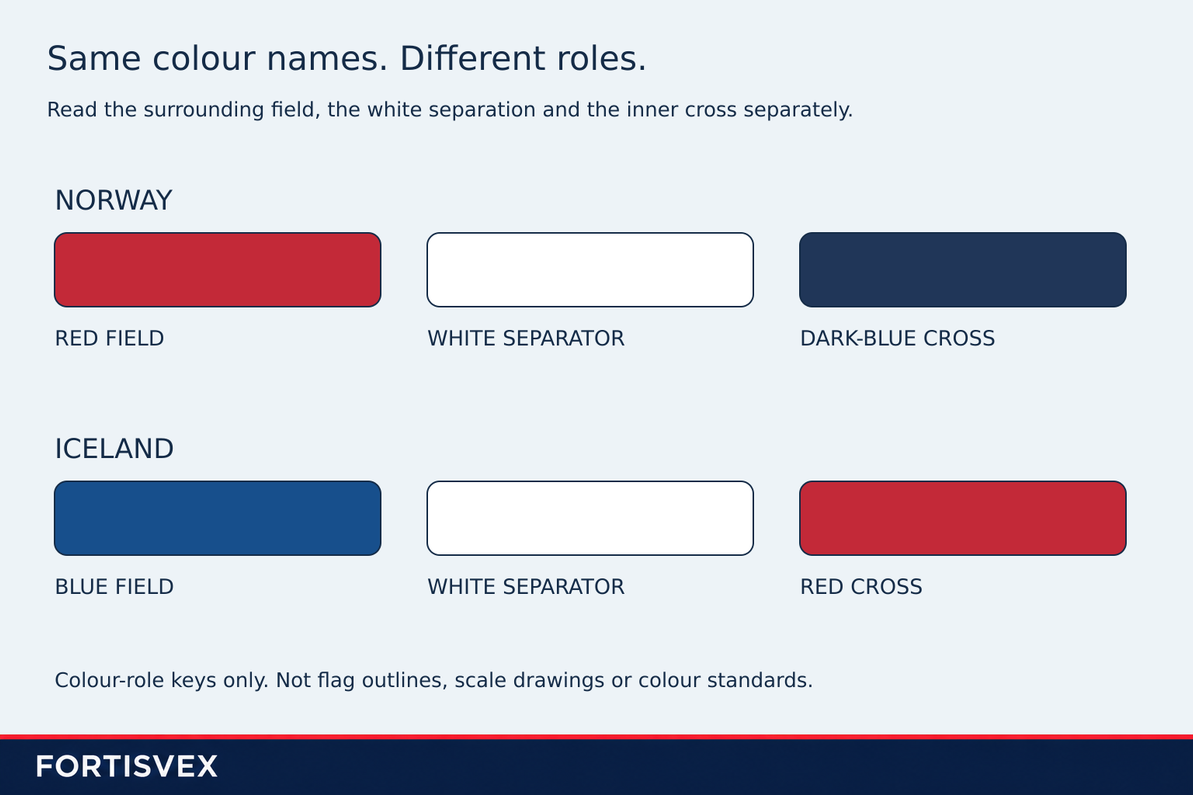
Norway and Iceland both use red, white and blue in a cross design. Listing those three colours does not distinguish the flags. The useful question is where each colour belongs: Norway has a red field and a dark-blue inner cross, while Iceland has a blue field and a red inner cross. White separates the two coloured areas in each design.
This comparison concerns the ordinary rectangular designs. It is a colour-role guide, not a drawing specification, a guide to official variants or an explanation of who may use them. The diagrams use labeled components rather than complete flag outlines, and their colours are illustrative.
Separate the field from the cross
The field is the surrounding background area. Naming it first prevents an easy mix-up: “red on the flag” might describe the broad field or the narrower cross inside it. Those are different jobs, even when the same colour name appears in both descriptions.
Norway’s Ministry of Foreign Affairs reproduces the design description in section 1 of its flag regulations page: a red field divided by a dark-blue cross, with white separating the cross from the red areas. For identification, keep those three components together: red surrounding field, white separation, dark-blue centre.
That is a description of appearance, not a new account of how the design was adopted. Our article on Norway’s 1821 flag-design debate treats the separate historical question of agreement on the design and disagreement over authority.
Iceland gives the colours different jobs
Article 1 of Iceland’s national-flag law describes a blue flag with a white cross and a red cross within the white cross. In this arrangement, blue fills the surrounding field and red occupies the inner cross. The white part remains visible between them.
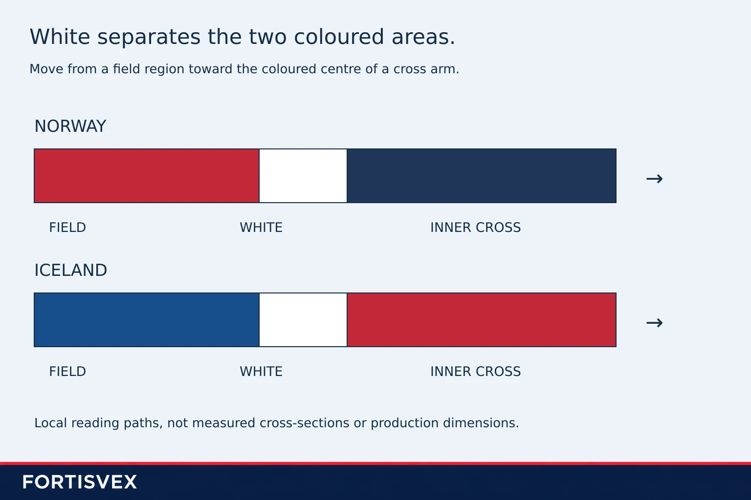
“White separator” is a reading aid in this article, not a replacement for the source’s wording. The Icelandic text describes one cross within another; the Norwegian description identifies a white border around the coloured cross. Either way, the white region should not disappear from the description.
Describe the roles, not just the palette
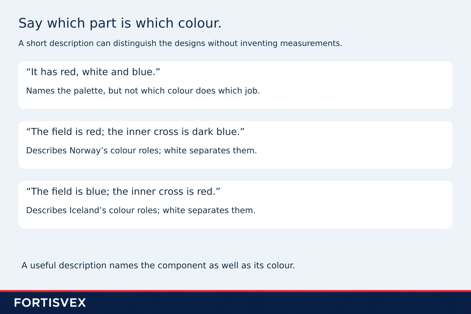
A practical comparison can be made in two short sentences. For Norway: the surrounding field is red and the inner cross is dark blue, separated by white. For Iceland: the surrounding field is blue and the inner cross is red, separated by white. This is more informative than saying that both flags are red, white and blue.
The distinction is about arrangement, not whether the colours have been named correctly in isolation. Ireland and Côte d’Ivoire provide a different example: the same three colour names appear in both flags, but their outer bands have different orders. Those are vertical-band designs, not cross templates; the comparison illustrates the value of naming each colour’s role.
Keep colour placement separate from geometry
Correctly assigning the colours does not establish correct cross widths, outline proportions or colour-standard values. Nor does it certify the fabric, stitching, reverse appearance or attachment details of a finished flag. The diagrams here deliberately do not supply those specifications.
For a comparison where measurements are the point, see Sweden and Finland’s crosses at the same height. That article uses separate source grids. Its measurements must not be transferred to Norway or Iceland simply because all four designs include a cross.
The identification takeaway is the relationship between the parts: field, white separation, inner cross. Norway places red around dark blue; Iceland places blue around red. Keeping the white separation and the component names in the description makes the difference clear without turning a colour key into a manufacturing drawing.
Recent Posts
-
Czechia’s Flag: The Blue Wedge Reaches Halfway Along the Fly
Czechia’s flag is not fully identified by a glimpse of white above red. The blue wedge at the attach …Nov 18th 2026 -

A Capitol-Flown Flag: What Its Certificate Can Tell You
A flag described as “flown over the Capitol” carries a claim about an event, not simply a descriptio …Nov 18th 2026 -

The Olympic Flag: Why Ring Colours Are Not a Continent Key
A colour-coded continent legend can make an Olympic flag display look easy to explain. It also gives …Nov 18th 2026