
Australia’s Flag Has Two Different Star Stories
The large star below the Union Jack and the stars on the fly do different jobs. Reading their positions first makes the symbolism much easier to understand.
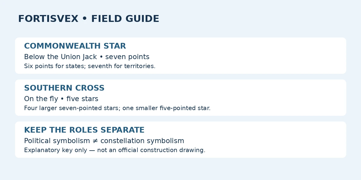
The Commonwealth Star is the federation symbol
The Australian Government’s Australian Symbols booklet identifies the large star below the Union Jack as the Commonwealth Star. Its seven points have a specific explanation: six represent the states, while the seventh represents the territories. This is not a seven-state count, and it is not a census of every Australian jurisdiction today. When writing a caption, keep the government’s distinction between states and territories intact. “Seven points representing the states and territories” is less informative than explaining the six-plus-one relationship.
The Southern Cross is a separate group
On the fly, the Southern Cross consists of four larger seven-pointed stars and a smaller five-pointed star. The same government booklet identifies the constellation’s stars as Alpha, Beta, Gamma, Delta and Epsilon Crucis. These five shapes should not be read as five more states. They belong to a constellation motif. The repeated seven-point shape can make the two systems look related to a casual viewer, but shared geometry does not mean shared symbolism. Position and grouping distinguish the Commonwealth Star from the Southern Cross more reliably than point count alone.
Why a seventh point appeared in 1908
The National Archives of Australia’s flag history explains that the original Commonwealth Star had six points and gained a seventh in 1908 to represent the territories. That change is useful context when looking at early designs. It does not mean an unfamiliar six-point image can be dated confidently from this feature alone. The image could show an earlier design, a later illustration of that design or an inaccurate rendering. A responsible caption distinguishes the design being depicted from the date on which the picture or object was actually made.
The Southern Cross also has a design history
The Australian Flags booklet describes another detail that can surprise readers: the competition-winning Southern Cross stars originally had differing numbers of points, from nine to five, intended to reflect brightness. A drawing published in the Commonwealth Gazette on February 23, 1903 standardized four larger stars with seven points and the smaller star with five. This is a different development from the Commonwealth Star’s 1908 change. Putting both changes into one vague sentence about “the stars becoming seven-pointed” would obscure which stars changed and when.
Use a two-column explanation in a display
For a school worksheet or community display, divide the explanation into two columns. Label the first “Commonwealth Star” and describe location, point count and political symbolism. Label the second “Southern Cross” and describe the five-star group and its constellation identity. Then ask readers to identify each feature on an accurate official image. This keeps the exercise focused on evidence rather than artistic memory. It also lets a reader who cannot distinguish small star points understand the main difference through the written descriptions. Our diagram summarizes those roles without pretending to reproduce the flag’s official geometry.
Keep the Union Jack in the explanation
The stars are not the flag’s only major element. The Australian Government identifies the Union Jack in the upper-left quarter as an acknowledgment of the history of British settlement. A star-focused article or classroom activity can legitimately concentrate on one detail, but its caption should not suggest that the stars explain every part of the flag. One useful structure is a broad opening sentence naming the Union Jack, the Commonwealth Star and the Southern Cross, followed by the narrower comparison. That gives readers orientation before asking them to examine individual shapes.
Do not let a simple diagram become a manufacturing guide
A diagram of symbolic roles is not a specification for producing a flag. If you need exact proportions, star positions or construction details, use the official design material rather than enlarging a blog illustration. The same distinction helps when evaluating an educational graphic: it may be excellent at explaining meaning while deliberately omitting precise geometry. Label the illustration accordingly. In a display handout, you can use a short textual key alongside an official reference image instead of asking one graphic to do both jobs. Avoid adding decorative stars that could be mistaken for part of the design.
Official sources
Recent Posts
-
South Korea’s Taegeukgi: Check the Four Trigrams and Artwork Orientation
The South Korea flag, known as the Taegeukgi, is a good example of why artwork review should go beyo …Nov 2nd 2026 -
Brazil Flag Artwork: Check the Star Map Before Approving the Proof
The blue globe on a Brazil flag rewards a closer look. When buying a flag or reviewing a production …Nov 2nd 2026 -
Mexico Flag: The Eagle Is Part of the Design, Not an Optional Logo
A Mexico flag can look familiar at a glance while still needing a closer artwork check. When compari …Nov 2nd 2026