
The Map Inside the United Nations Flag
The United Nations flag asks you to look at the world from an unfamiliar direction. Instead of spreading the continents across a rectangular classroom map, its emblem gathers them around the North Pole. Understanding that viewpoint makes the design easier to read—and helps explain why an organization concerned with the whole world chose a map for its symbol.
Start at the center
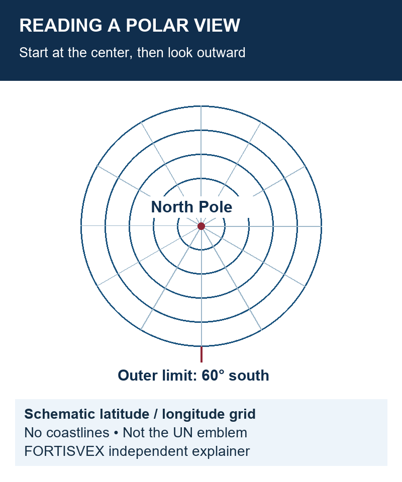
The UN’s Dag Hammarskjöld Library guide to flags and the emblem identifies the projection as azimuthal equidistant, centered on the North Pole and extending to 60 degrees south latitude. The surrounding olive branches represent peace; the map expresses the organization’s worldwide concern for peace and security.
Try looking at a globe from directly above its northern end. Then imagine drawing the lines of longitude outward from that central point. This is a useful way to approach the diagram below, although a flat projection is a calculated representation, not simply a photograph taken above a globe. The exercise changes your starting point: north is at the center, rather than being a direction toward the top edge of a rectangular map.
What “equidistant” does—and does not—mean
The word can sound as though every distance on the drawing is correct. That would be a mistake. The U.S. Geological Survey’s explanation of map projections notes that a flat map cannot preserve every property of a globe. An equidistant projection preserves distances along particular lines, such as those radiating from its center; it does not promise accurate distance measurements between every pair of places.
That distinction is useful beyond this flag. Before comparing two maps, ask what each was designed to preserve: direction, distance, area or shape. A change in a continent’s apparent outline does not, by itself, tell you that one map is careless. It tells you to investigate the projection. On a flag, the map also has to work as a recognizable symbol, so it should not be treated as a substitute for a detailed atlas.
One emblem, a later flag
The General Assembly approved the emblem on December 7, 1946. The flag followed on October 20, 1947. On the flag, the emblem is white against a light blue field. These are separate milestones, as the UN Library’s chronology makes clear: the approval of the symbol and the adoption of the flag did not happen on the same day.
When labeling an exhibit or school project, identify what a date describes. “Emblem approved” and “flag adopted” are more informative than a bare year. The same habit helps when comparing international flag designs: a design, an institution and a particular physical flag can each have a different history.
A short looking exercise
- Locate the center. Begin with the projection’s viewpoint before trying to recognize every coastline.
- Separate map and symbol. Discuss what the geography shows, then what the surrounding branches communicate.
- Check the caption. Does it distinguish the emblem’s approval from the flag’s adoption?
- Keep interpretation accountable. Label your own observations as observations; use the official source for the organization’s explanation of its design.
This is an educational reading activity, not a set of display regulations. The UN guide separately identifies rules governing flag and emblem use. Understanding a symbol does not establish permission to use it as an organization’s logo or suggest an affiliation.
FORTISVEX publishes this independent guide to help readers look more closely at flags. For a physical display, compare the specific item’s dimensions, attachment and intended use rather than assuming that a familiar design guarantees the right configuration.
Recent Posts
-
South Korea’s Taegeukgi: Check the Four Trigrams and Artwork Orientation
The South Korea flag, known as the Taegeukgi, is a good example of why artwork review should go beyo …Nov 2nd 2026 -
Brazil Flag Artwork: Check the Star Map Before Approving the Proof
The blue globe on a Brazil flag rewards a closer look. When buying a flag or reviewing a production …Nov 2nd 2026 -
Mexico Flag: The Eagle Is Part of the Design, Not an Optional Logo
A Mexico flag can look familiar at a glance while still needing a closer artwork check. When compari …Nov 2nd 2026