
The NATO Flag’s Compass Rose: From a Proposed Shield to a Shared Direction
The NATO emblem can look like a star at first glance, but its official explanation begins with a compass. That choice followed a design process in which a very different proposal, a shield carrying fourteen stars, was considered and left behind.
NATO’s retrospective account, “A star is born,” describes a search for a simple, striking emblem that could express the Atlantic community’s shared ideals and the peaceful purpose of the North Atlantic Treaty. The proposed shield, the adopted flag emblem and the later headquarters sculpture are three different objects in that story.
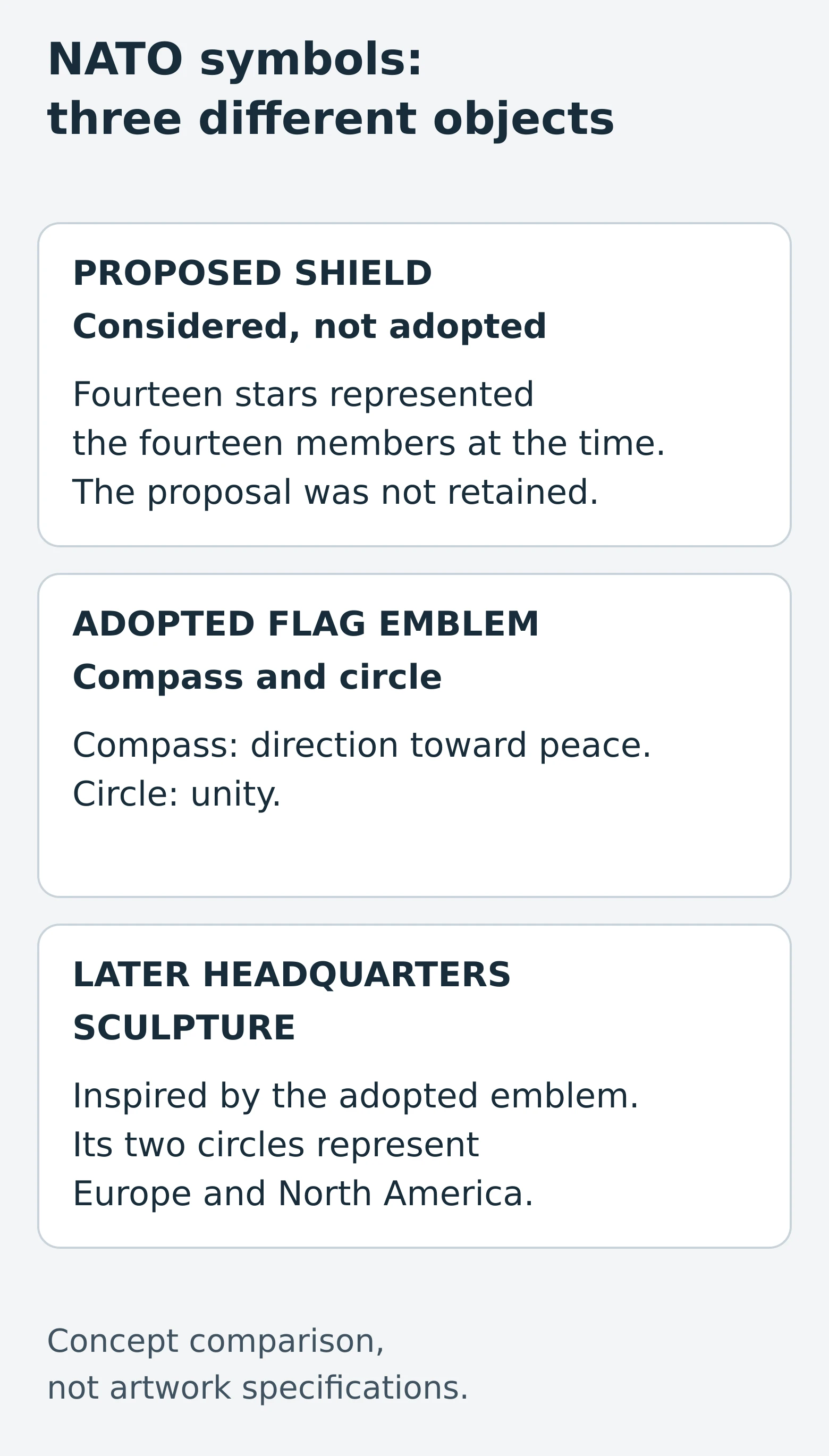
A shield proposal with a changing count
One proposed design used a silver shield to represent defence and protection. Two blue stripes represented the Atlantic Ocean, while fourteen stars stood for NATO’s fourteen members at the time.
That direct link between the number of stars and the number of members created a practical difficulty: another member would require a change to the emblem. NATO’s account identifies that issue, but does not establish it as the sole reason the proposal was not retained.
The shield belongs to the history of designs considered for NATO. It should not be described as a previous official NATO flag. The distinction matters whenever an old proposal appears beside the familiar emblem: a drawing can document a design process without documenting an adopted flag.
A compass and a circle
The adopted design used a four-pointed form representing a compass. In the explanation quoted by NATO, Secretary General Lord Ismay connected the compass with direction toward peace and the circle with unity. The blue background represented the Atlantic Ocean.
This gave the emblem a different organizing idea from the proposed shield. The shield’s individual stars represented individual members; the compass and surrounding circle conveyed a shared direction and a bond between them.
The organization’s own account uses the word “star” when describing the four-pointed form, so the familiar nickname is understandable. Its stated meaning, however, is a compass. Calling it a compass rose helps keep the explanation attached to the design rather than treating it as a decorative star.
The sculpture is a later interpretation
The three-dimensional landmark at NATO headquarters in Brussels is another part of the story. NATO’s history of the “NATO star” sculpture identifies Belgian architect Raymond Huyberechts as its designer and describes a stylized compass inspired by the emblem. The sculpture was erected in 1971.
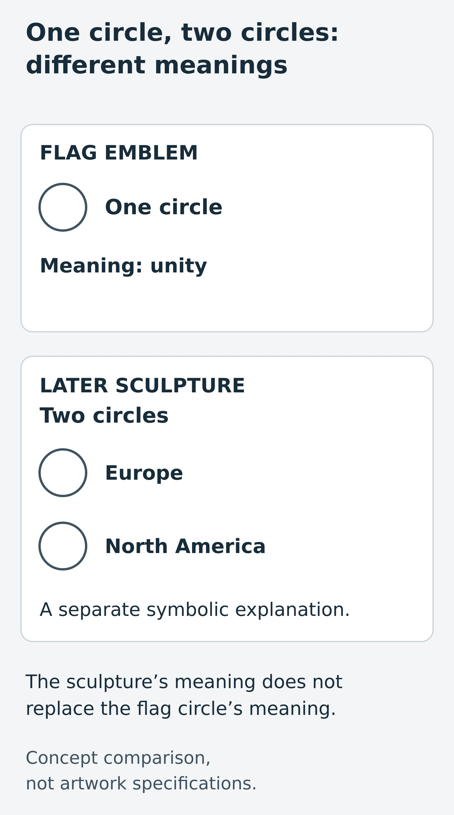
Here the account gives two circles a particular meaning: Europe and North America. That explanation belongs to the sculpture. It should not be carried back to the flag emblem, whose single circle is explained as unity.
The relationship is inspiration, not identity. A flat emblem can become the starting point for an architectural object while the later work adds its own structure and explanation.
Keep the three objects distinct
The proposed shield records an option that was considered. The adopted compass and circle explain the flag’s symbolic design. The headquarters sculpture is a later interpretation with two circles and a separate physical history.
Reading those objects separately makes the story clearer: NATO’s flag was not simply a shield with its stars rearranged, and the sculpture is not a specification for drawing the flag. Each should be described using the evidence for that particular object.
Recent Posts
-
Wigwag Signals
Civil War signal flags needed to be seen, yet visibility could invite interception. Albert J. Myer p …Nov 5th 2026 -
Norway’s Flag in 1821: Agreement on Design, Disagreement on Authority
In 1821, Norway’s parliament and king accepted the flag’s design while disputing who could determine …Nov 5th 2026 -
Reading Beach Warning Flags: Check the Local Sign, Not Just the Color
A beach warning flag is easier to recognize than to interpret. You may remember a color from anothe …Nov 5th 2026