
Why Canada’s Flag Has an Eleven-Point Maple Leaf
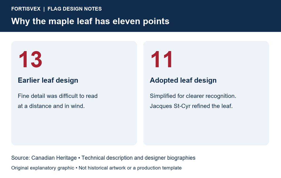
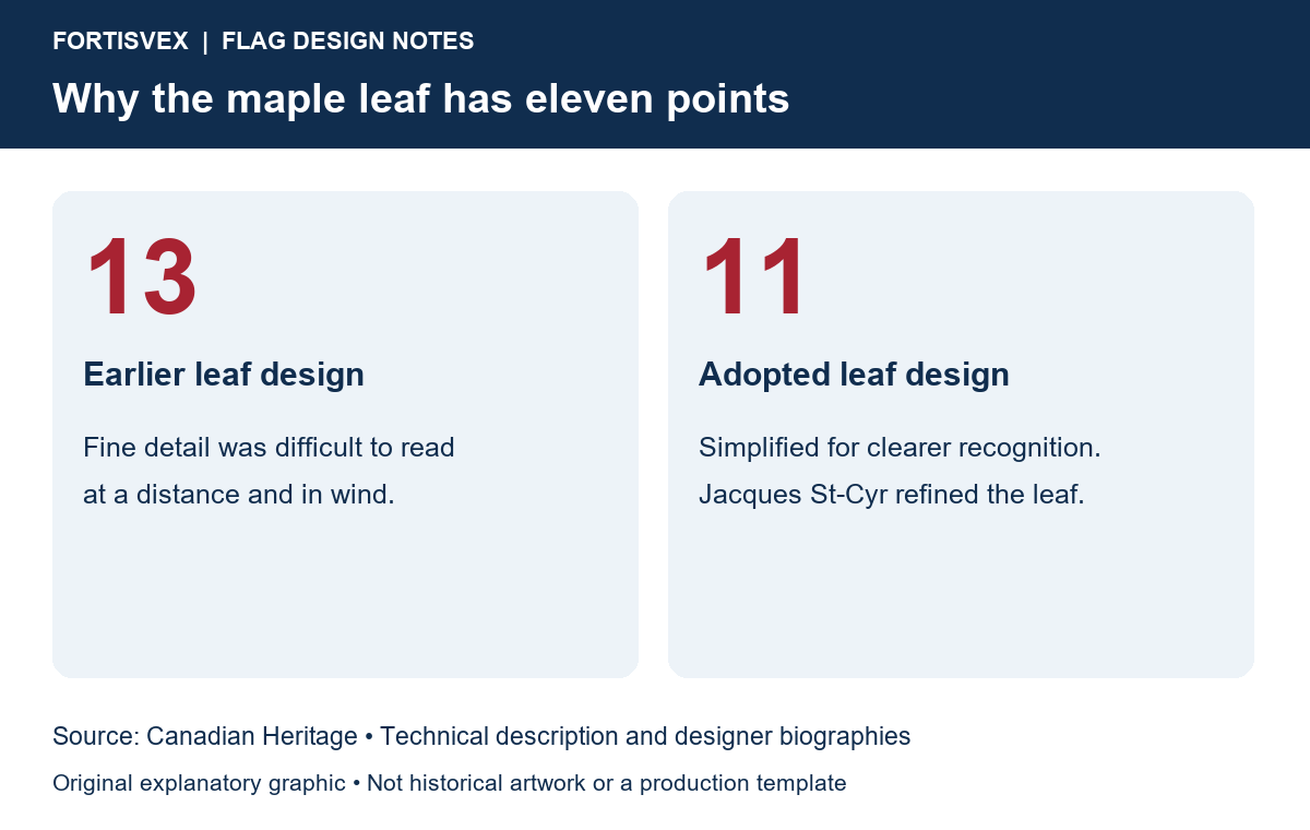
The eleven points on Canada’s maple leaf are a design decision with a practical purpose: making the leaf easier to recognize. Canadian Heritage explains that an earlier thirteen-point design lost clarity at a distance and in windy conditions. The familiar eleven-point leaf solved that problem. It is a symbol intended to remain legible when the flag is moving, not just when a drawing lies flat on a desk.
A familiar leaf, carefully refined
Counting the tips is an easy classroom activity, but it can lead to an unsupported explanation: assigning a province or territory to every point. The government’s account describes a change made for visibility. That documented purpose is the sound explanation to give a visitor, a student or a child asking why this particular leaf looks the way it does.
Think of the difference between a book illustration and a flag across a schoolyard. A reader can bring a book closer and study small details. A person looking up at a moving flag cannot hold the fabric still. That difference helps explain why a simplified outline can communicate more effectively than a more intricate one. This is a useful way to discuss the design, without inventing a secret meaning for its points.
Who designed Canada’s flag?
The answer involves several people. George Stanley proposed the concept that inspired the final flag. Heraldic artist Alan Beddoe produced the original graphic rendering of Stanley’s idea. John Matheson helped the proposal achieve committee consensus. In the final design work, Jacques St-Cyr refined the maple leaf, George Bist worked out proportions, and physicist Günter Wyszecki determined the red. Patrick Reid led the team responsible for the final design parameters.
These contributions are distinct: choosing a concept, drawing a symbol, calculating its layout and specifying a colour are different jobs. Canadian Heritage’s designer biographies make it possible to credit that collaboration rather than compress the story into a single inventor.
From debate to a national flag
The final single-leaf design was not Prime Minister Lester Pearson’s original preference. His proposal featured three leaves and blue borders. A parliamentary committee selected the concept that developed into today’s flag in October 1964. Following parliamentary approval, the royal proclamation came on January 28, 1965. The new flag was raised at Parliament Hill on February 15, 1965.
Those dates mark different steps: selection, formal proclamation and the first flag-raising. Keeping them separate makes a timeline more useful than saying simply that the flag “began in 1965.” The official history of Canada’s flag traces the debate and adoption.
Read the whole design before choosing a flag
The leaf attracts attention, but the surrounding geometry matters too. In the official 2:1 layout, a flag three feet high would be six feet long. Its white centre is a square. A generic maple leaf placed on a differently proportioned rectangle does not reproduce that specification.
When comparing Canada flags, read the actual dimensions and the individual listing’s attachment details. A country name alone does not establish the shape, material or fit for your flagpole. For a display with several countries, check each flag’s documented proportions rather than assuming every national design uses the same rectangle.
Keep the leaf facing the right way
Canadian Heritage’s display guidance places the leaf upright in a horizontal display. When the flag hangs vertically, its top point faces the viewer’s left. The guidance also calls for Canada’s flag to have its own flagpole rather than sharing one with another flag. These are Canadian conventions; do not automatically substitute another country’s display rules.
Before a ceremony, check the orientation from the audience’s position. This simple rehearsal is especially useful for a hanging backdrop that looks different from a flag on a pole. Consult the official flying guidance for the particular setting, and use the international flag collection to compare the actual items needed for your display.
Recent Posts
-
South Korea’s Taegeukgi: Check the Four Trigrams and Artwork Orientation
The South Korea flag, known as the Taegeukgi, is a good example of why artwork review should go beyo …Nov 2nd 2026 -
Brazil Flag Artwork: Check the Star Map Before Approving the Proof
The blue globe on a Brazil flag rewards a closer look. When buying a flag or reviewing a production …Nov 2nd 2026 -
Mexico Flag: The Eagle Is Part of the Design, Not an Optional Logo
A Mexico flag can look familiar at a glance while still needing a closer artwork check. When compari …Nov 2nd 2026